- Announcing Argos Education
- Argos: Upcycling Course Design
- Argos: Making Good Course Design Easy and Fun
I’ve been building the Argos story slowly in this series for two reasons. First, we’re in something like a trough of disillusionment with courseware products. “Trough of disillusionment” is a term from the Gartner Hype Cycle about how innovations are viewed in the marketplace over time:

I say “something like” the trough of disillusionment because the hype cycle is really about expectations rather than product/market fit. A new product comes out and we get excited because we’re told it will “change everything.” It doesn’t. We get disappointed. We decide we’ve been scammed. Over time, we figure out that, even though the new thing isn’t going to change everything, it’s useful for some things. Once we finally figure out what it’s good for, we talk about it less and use it more. Throughout the whole process, the thing itself often hasn’t changed. Oh, sometimes the start-ups decide pivot, or they die because they can’t outlast the trough. But Stanford-style MOOCs, for example, haven’t changed all that much since 2012. We just know what they’re good for now.
I don’t think that’s what’s going on with courseware. It feels like a trough of disillusionment. In 2014, Campus Technology wrote about “The Great Adaptive Learning Experiment.” (One sign that the market is mixed up is that we can’t seem to settle on terminology. Are we talking about adaptive learning, personalized learning, or courseware? What’s the difference?) Since then, we’ve seen a handful of these “personalized learning” companies—e.g., Knewton, Acrobatiq, and Smart Sparrow—sold off for a low price and largely fade into the companies that bought them. CogBooks was the latest to be sold off to Cambridge University Press. While this may be a decent deal for CogBooks—the financials have not been disclosed—I doubt it will be read as a sign that this product category is changing the world. The big textbook publishers have done OK with courseware but not well enough to halt their continuing shrinkage as businesses.
There’s a general sense of disappointment and malaise with the product category. I’m arguing that this is not a genuine trough of disillusionment but a failure of product/market fit. This is actually much more common in EdTech product categories. Think of retention early-warning analytics, ePortfolios, and learning object repositories, among many others. They all got hyped, disappointed the market, and then got stuck. The problem wasn’t that the market misunderstood the product but rather that the product makers misunderstood the market.
My colleagues and I believe that the same thing has happened with courseware. The market has gotten stuck on an idea of the value that doesn’t actually appeal to the people who have to adopt and use it. There was some progress when publishers realized that students like low-stakes practice. Before EdTech, many students voluntarily created flashcards for themselves. When publishers realized that students were increasingly refusing to buy the expensive curricular products that their professors were prescribing, they became more “learner-centric,” by which they meant that they thought of students as the buyers. So they built in features that students would like. Low-stakes practice. That helped some. But then they got stuck again.
Low-stakes practice could give instructors more information about how their students are doing. It could change the way those instructors teach. But so far, it mostly hasn’t. Which means that instructors don’t see value in prescribing courseware over alternative formats, like simple ebooks. The “market” for textbooks is both students who buy the product and instructors who prescribe it. Both use the product in some important sense. But on the instructor side, the paradigm has largely been stuck in the bound book format. It’s immutable. It’s a thing they adopt and then teach around.
In contrast to the publishers, stand-alone course platform providers went in the complete opposite direction. They gave instructors a blank page. In their later stages before their acquisition, these vendors invariably—invariably—began developing or acquiring catalogs of titles so that instructors wouldn’t have to start from scratch. That tells us something about product/market fit. But the platform vendors also differed from the publishers in that they were selling their platforms first to institutions as enterprise software licenses. Those institutions then typically engaged in top-down efforts to get faculty to adopt the platform and develop content. In this conception, the product has three kinds of customers—the institution paying the license fee, the instructor adopting (or creating) the curricular product on the platform, and the students who are using (and possibly paying for) that curricular product.
It doesn’t work.
The joy and magic of product/market fit
Way back in the first sentence of this post, I said there were two reasons why I’ve been building this story slowly. The second reason is that I take joy in writing this way. It’s a teacher thing. I want to make you care about things that you don’t think you care about. I want to make you spend time thinking about topics that you never thought you’d spend time on.
You think you wouldn’t spend time reading a long piece on how fMRI machines work, the mathematics behind certain kinds of machine learning, and how these pieces come together in a methodological paper in cognitive psychology? You think there’s no way you would read a seven-thousand-word article on how Pearson is using HR policies to foster efficacy in its organization (which, by the way, was published on New Year’s Day)?
Heh. Let’s put that to the test. I bet I can make you care. And I’ll spend days or even weeks researching and crafting a blog post to prove it.
Again, it’s a teacher thing. I have an urge. I will go to irrational lengths to fulfill that urge. But not infinite lengths. If I had to write these blog posts using Dreamweaver in raw HTML, I never would have gotten started blogging. I needed WordPress to lower certain barriers for me so that the urge could take over. Remember “web 2.0”? This is web 2.0. When I started blogging, I never imagined I would still be doing it 16 years later, or that literally almost everyone who has access to the internet is creating and sharing personal content over some platform, whether it’s Facebook, TikTok, Twitter, LinkedIn, YouTube…the list goes on and on.
Great product design works that way. I have spent a lifetime failing to get myself to exercise regularly. No product and no subscription I tried could crack that nut. Until I bought an Apple Watch and subscribed to Apple Fitness+. Now I do 30-minute yoga sessions at least three times a week. In good weeks, I’ll add a couple of core workouts and high-intensity interval training (HIIT) sessions.
And then there’s the kayaking. I wrote a post on product/market fit that included a description of origami kayaks that my wife and I use. We had a canoe a while back but it was too heavy and too hard to get on and off the car. Now we go kayaking. And, interestingly, I received a handful of notes from people who read my post and decided to buy themselves the same kayaks.
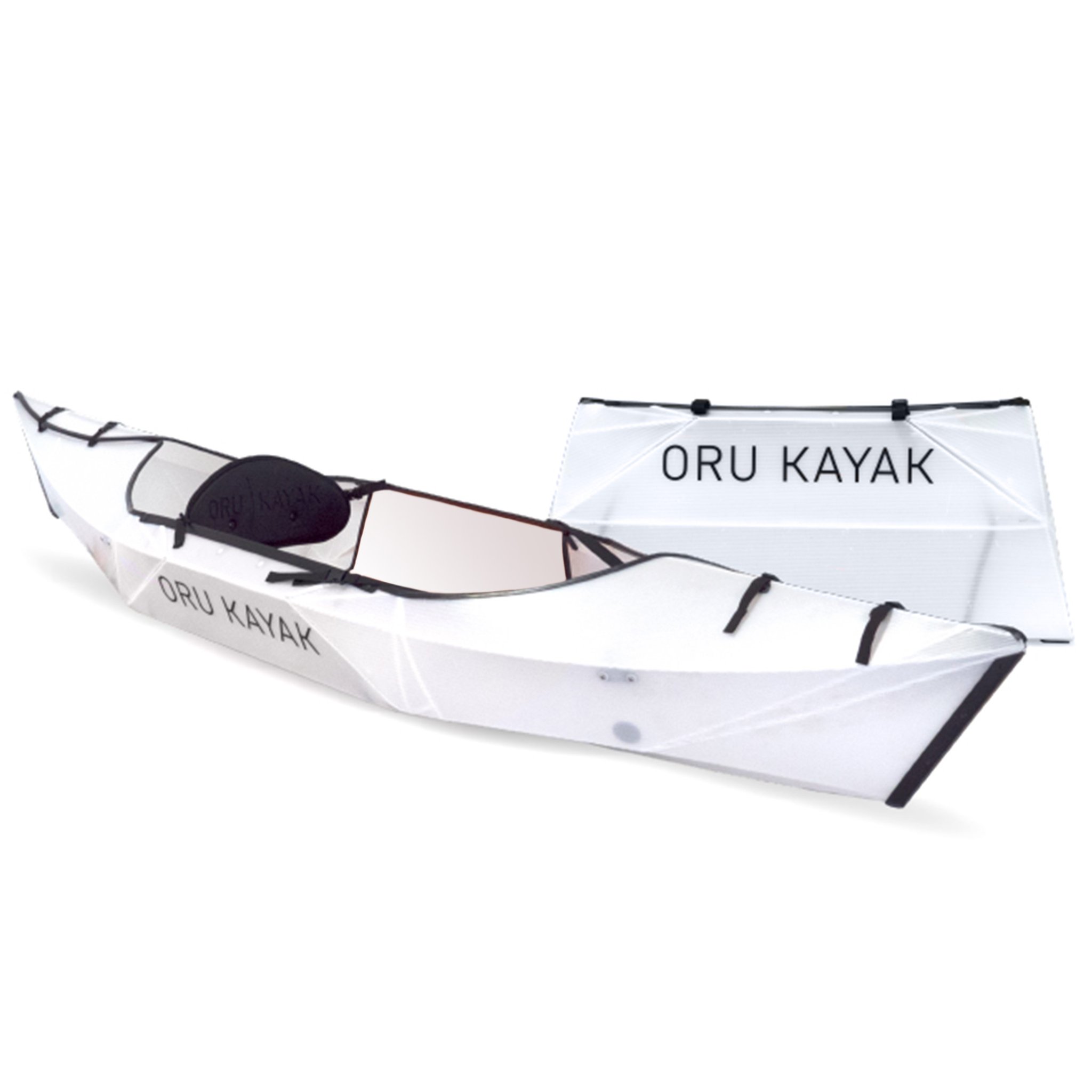
I always wanted to exercise regularly. Logistical and psychological barriers prevented me from doing so. It would have been easy to conclude from a distance that people like me don’t want to exercise. I did hate exercising, but I wanted to exercise. I wanted to not hate it. My Apple Watch and Oru Kayak enabled me to find ways of exercising that I didn’t hate. As a result, my lifelong behavioral patterns changed pretty dramatically.
One of the best examples for the story of courseware is Wikipedia. When it came out, most people thought it was nuts. The big thing in encyclopedias at the time was Microsoft Encarta, which was supposed to be a multimedia, interactive Encyclopedia Britannica killer. The idea that a bunch of randos on the internet would write a credible encyclopedia was literally a joke. Stephen Colbert encouraged his viewers to write absurd details into Wikipedia articles. Random people could never write a comprehensive encyclopedia with no formal coordination and no financial incentive. And even if they did, nobody would trust it.
Until, in 2009, The New York Times ran the headline, “Microsoft Encarta Dies After Long Battle with Wikipedia.”
Today, when you search on Google the top-right corner of your results page will often have information summarized from and linked to Wikipedia. I don’t know about you, but I click on that link fairly often. And I generally don’t think about whether I can trust the article it takes me to. As I write this sentence, random people on the internet are fact-checking and updating articles on Wikipedia. I’m not one of them. I’m mostly just a consumer. Most of you probably are too. And that’s fine. It works.
I started a Wikipedia page once because it was related to a particular EdTech topic that I was passionate about. I only wrote a couple of lines; it wasn’t much more than a stub for the topic. A bunch of other people each contributed a bit to the entry. I haven’t looked at it in years but others continued to contribute and update it This is the page today, complete with 148 footnotes. As I write this, the most recent update to the article was yesterday.
We forget about Wikipedia because now we’re thinking about Facebook, which is designed to facilitate the opposite kind of behavior. Humans are malleable and adaptable. But you have to understand their drivers if you want to fulfill their needs, particularly if doing so entails a change in their behavior.
My colleagues and I believe that the courseware product category is in a rut because the market has fundamentally misunderstood both how educators use curricular materials and how they would use them if only certain barriers were lowered for them.
Upcycling curriculum
In the first posts of this series, I wrote about how educators think about and use curricular materials in their course design. In this last section of this blog post, I’m going to start telling a story of how that can work using some mock-ups that we’re user testing. The goal here is to give some examples of how upcycling can work.
Let’s say you’re selecting a textbook for your Chemistry for Non-Majors course. Your goal isn’t really to pick textbook. It’s to design your course. You go into the store that has all the products that run on Argos Education’s Sojourner platform. You have some good choices. You could pick Carnegie Mellon OLI’s General Chemistry course, which has a mastery learning approach and has been carefully engineered for efficacy. You could teach with ASU Inspark Network’s Critical Chemistry, a heavily experiential learning-based product for non-majors that is thematically organized around how chemistry is used to save lives. But in your case, your college puts a strong emphasis on affordability. That’s a major priority. So you search the catalog particularly for inexpensive options:
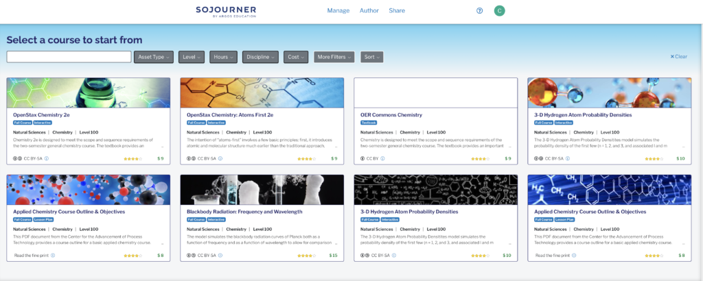
You’re still focused on getting through the curricular materials selection process so you can get to the course design process. You review the options and pick your title.
Now you have a choice. Are you working on your own? Are you leading a departmental adoption process? Maybe working with a learning designer or an OPM to create an online course? Maybe you want collaborators involved:
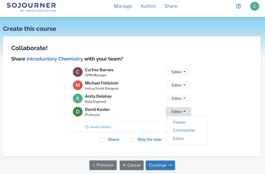
You have options based on your use case. And not everybody gets to edit. For example, maybe as a department, you want to have all instructors be able to see what you’re working on, some who are able to comment, and just a couple who are able to actually make changes. On the other hand, if you’re just making the selection yourself, you can skip over all this. Or you can invite your institution’s faculty support person or a colleague in to give you some suggestions.
But you’re still in adoption mode. You’re getting to know the text so that you can design your course. You’ve picked an unmodified OpenStax title, so it’s going to start off looking a lot like the free PDF version:
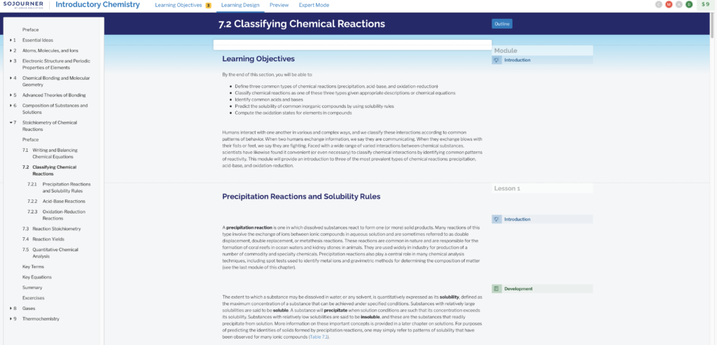
Notice the little notes on the right-hand side. We’ve applied a little machine learning and a little learning design research to make the pedagogical structure of the text more visible to you. If you mouse over the little item, you can see more detail:

Ah. This is interesting. You get this. It’s a bit like how you think about putting together your lectures. Maybe you want to switch to outline mode so you can see the overall structure of how this thing is put together:
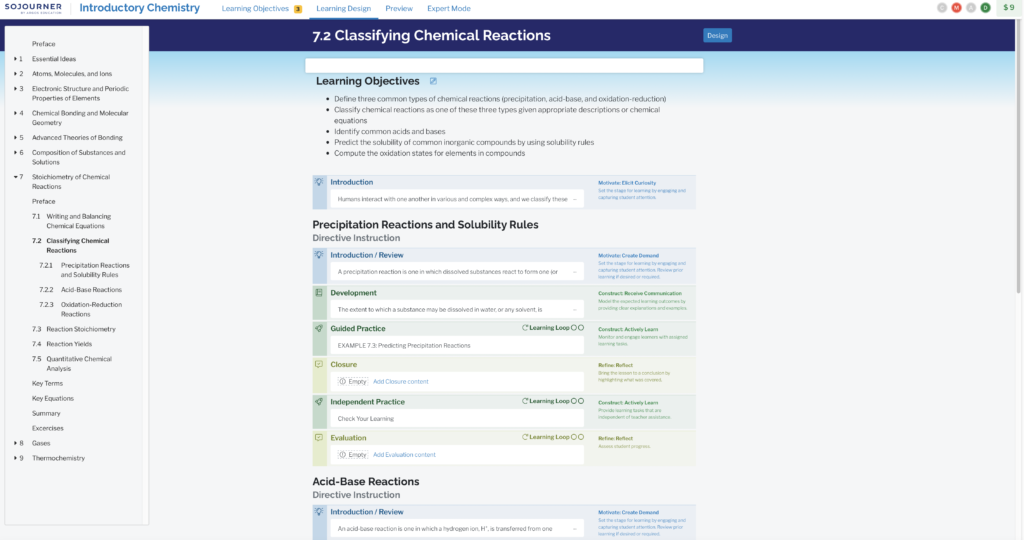
You’ve collapsed the text so that you can focus more on those little post-it notes and see the structure. It’s pretty much like a lecture. (It’s labeled “directive instruction” for a reason.) You introduce the concept to help students understand why the topic is important to the course, you provide them with some information, maybe you work a problem out for them—if you were doing this in class, you might work that problem out on a whiteboard—you…
Oh. Hmm. Usually you wrap up the lecture with a summary. This text doesn’t do that. You could fix that, but honestly, you’re not too worried about it.
The OpenStax text also doesn’t give an end-of-chapter test at the end. The truth is that you’d want to pull together some questions from a test bank anyway. So you’ll worry about that later too.
You dive back into Design mode to review the text. You want to give it a close reading now as you think through the design of your classes. And you find another unpleasant discovery. The section on acid-base reactions is just not right for your class. The language is a bit garbled and probably unnecessarily complex for your students.
This is the point when you would normally write the following in your syllabus:
When you get to Section 7.2.2 on acid-base reactions, do not read it. Instead, please go to this folder in Canvas and read the document called “Acid-Base Reactions.” Follow the link at the bottom of the page and take the quiz there. Then read the rest of Section 7.”
Which is not ideal for anyone. For you, you’re writing documents and organizing folders and diving into LMS quizzing tools and then trying to knit together what the students are doing in the LMS with what they’re doing in the courseware. For the students, they’re jumping through hoops.
But instructors do it all the time. Locking down the courseware might create enough friction that they will do it less often than they might otherwise. But many of them will do it. It’s a bad experience for everyone. And there’s no way for anyone to tell if the net result is better or worse for the student because the activity is happening in different systems that don’t really talk to each other. But as a dedicated instructor, you will do it if you think it will help the students.
Or, if you’re in a platform that allows you to edit the curricular materials, you could just do this:

This is better for everyone. Students don’t have to jump through hoops. Instructors spend much less time setting up the content. And now that all the information is in one system, it’s possible to track whether these changes actually help students. That last piece is another topic for another blog post, but it’s incredibly important. If we want to create a virtuous cycle, we want to share changes, test which ones improve learning in which contexts, and generally create positive evolutionary pressure.
Finding teachable moments in the course design process
This idea of pulling editing “inside the tent” is central to understanding product/market fit and the levers available to change behaviors. As an instructor, you are mostly not trying write or rewrite textbooks. That’s not you think about what you’re doing, in part because the textbook is the raw material for their course design. It’s not a thing you care about in and of itself.
We want to catch you in those moments when you’re thinking about their course design and pull you into a kind of dialog as you use the raw materials to build that course.
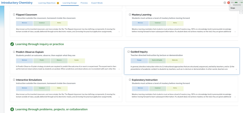
And we’re always making choices about what we want to ask you to think about and what we want to get out of your way. If you want to add a virtual lab, maybe we give you the option of some scaffolding to help you think through all the steps you want students to go through:
When you pick their actual virtual lab, maybe we don’t bother you by calling attention to the learning objectives but we do show you a selection of labs that are tagged with the learning objectives associated with the content section you are working on:
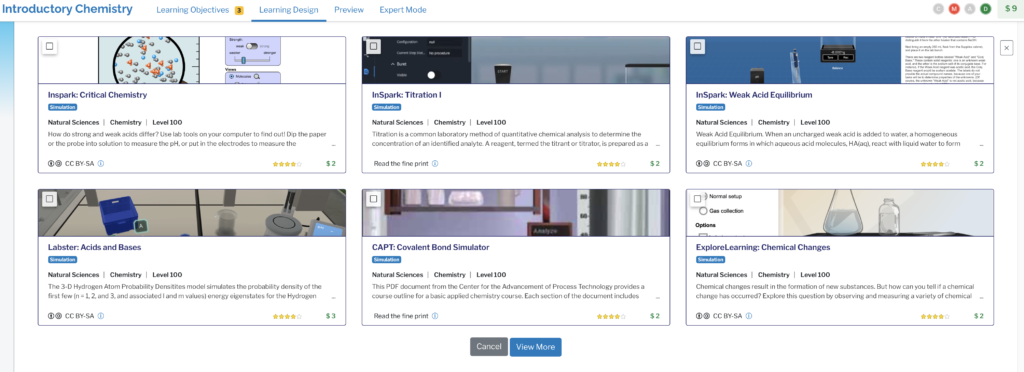
When you choose the lab, we let you see the cost change and, if you have set a cost cap, we warn you when you go over. We even give you a breakdown of what you’re asking the students to pay for:

We don’t always want to hide learning objectives from you. Rather, we pick the moment when learning objectives are most useful to think about, like when you’re picking out assessment questions:
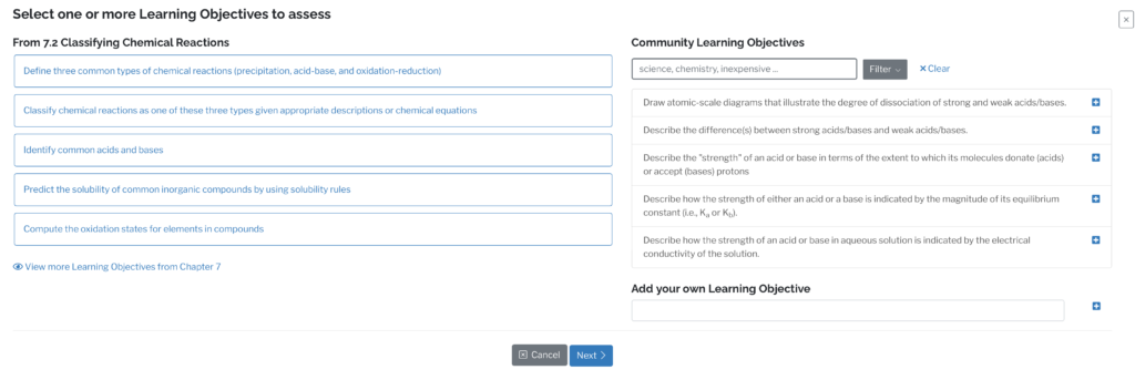
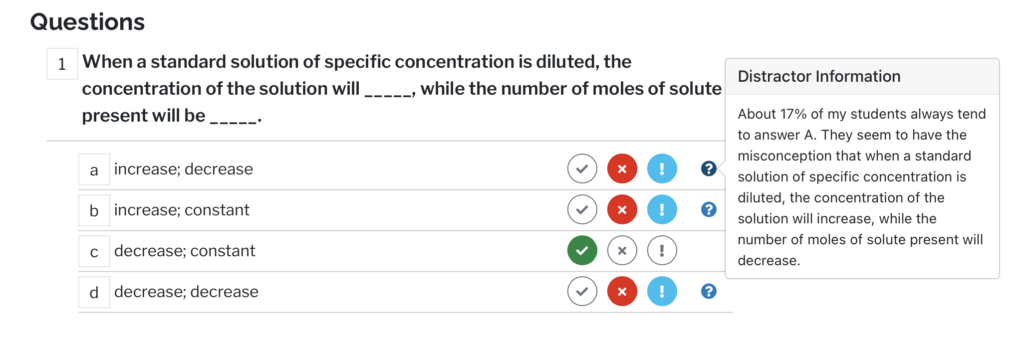
Notice that the platform introducing a bit of implicit community here. Other instructors are also designing courses around the same curricular product that you are. Maybe they have some good ideas that they’re willing to share.
And the real value of the sharing is not just the content but the rationale behind the course design. Why did the author write a particular answer in a particular way?
I could go on, but hopefully the theme is clear.
Professionally designed courseware has a lot of useful information either explicitly or implicitly built into it. We hide that design information from the instructors and then lock the product down. In doing so, we turn it into a static artifact that they have to work around. However the publisher might conceive of the product’s value is irrelevant if instructors are using it as raw materials for their course designs.
But if you start from that assumption, let them do what they’re going to do anyway in an environment where you can scaffold, collaborate, and provide feedback on the results of their designs, you can engage them in a much deeper way while saving them time and giving them more control over the things they care about. Also, we no longer have to separate conversations about course design from conversations about effective teaching practices. The fact that we do so now is a strong indicator that something is broken in our ecosystem. Course design and in-the-moment teaching are a continuous cycle. The two are constantly in dialog with each other. That’s the way teachers actually teach in the real world. Lesson plans change. You adjust. You improvise. Much of this is not arbitrary but rather driven by your encounters with your students.
If we want courseware to grow in adoption and educational impact (and perhaps as a useful and self-sustaining industry), we have to get away from the book. That doesn’t just mean getting away from linear, non-interactive designs. More importantly, it means getting away from the textbook as a static artifact that educators teach around.
By the way, today’s Blursday Social (9/16 at 4 PM ET) will be a chat about Argos. So you can come to that if you’re curious. Sign up here.
I note that making the pedagogy visible is not only valuable to the instructor, but can be valuable to the learner. If you’re supporting them becoming self-improving practitioners, seeing how you developed their learning experience gives them a framework to internalize. Start handing control for choice of learning content and practice, scaffolded, with support for opening up how why your choices, provides a model for them to adopt.
Great point, Clark. One of the challenges with that is that the pedagogy is often tacit knowledge with the educator. She can’t articulate it to the student clearly because a lot of what she does is intuitive rather than conscious. Once the educator can attach words and concepts to her teaching moves, she is in a better position to help the student with metacognition.