Last week I wrote a post What Harvard and MIT could learn from the University of Phoenix about analytics. As a recap, my argument was:
Beyond data aggregated over the entire course, the Harvard and MIT edX data provides no insight into learner patterns of behavior over time. Did the discussion forum posts increase or decrease over time, did video access change over time, etc? We don’t know. There is some insight we could obtain by looking at the last transaction event and number of chapters accessed, but the insight would be limited. But learner patterns of behavior can provide real insights, and it is here where the University of Phoenix (UoP) could teach Harvard and MIT some lessons on analytics.
Beyond the University of Phoenix, there other examples of learner-centered analytics exploring usage patterns over time. While I was at a summit at the University of Wisconsin at La Crosse last week, Bob Hoar showed me some early results of their “UW-System College Readiness Math MOOC” research that is part of the MOOC Research Initiative. I interviewed Bob Hoar and Natalie Solverson as part of e-Literate TV, where they described their research project:
The results to date focus on capturing and visualizing the student patterns, and progress can be tracked at this project site (go to the site to see interactive graphics).
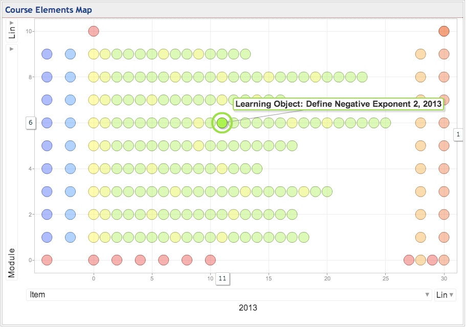
The Desire2Learn learning management system recorded a log containing over 1.2 million ‘events’ that occurred during the first few months of the MOOC. Each event corresponds to the action of a particular student. Each action, as well as a timestamp, was recorded. The image below contains a graphical representation of the elements of the course. The items on the horizontal axis (y=0) represent information about the course (syllabus, FAQ, how to contact instructors, etc.). The other items in the chart relate to the mathematics content; the (WebWork) homework, the quizzes, the online office hours and the live tutoring and lectures for the 9 math modules in the course. Hover over each bubble to see a short description of the item.


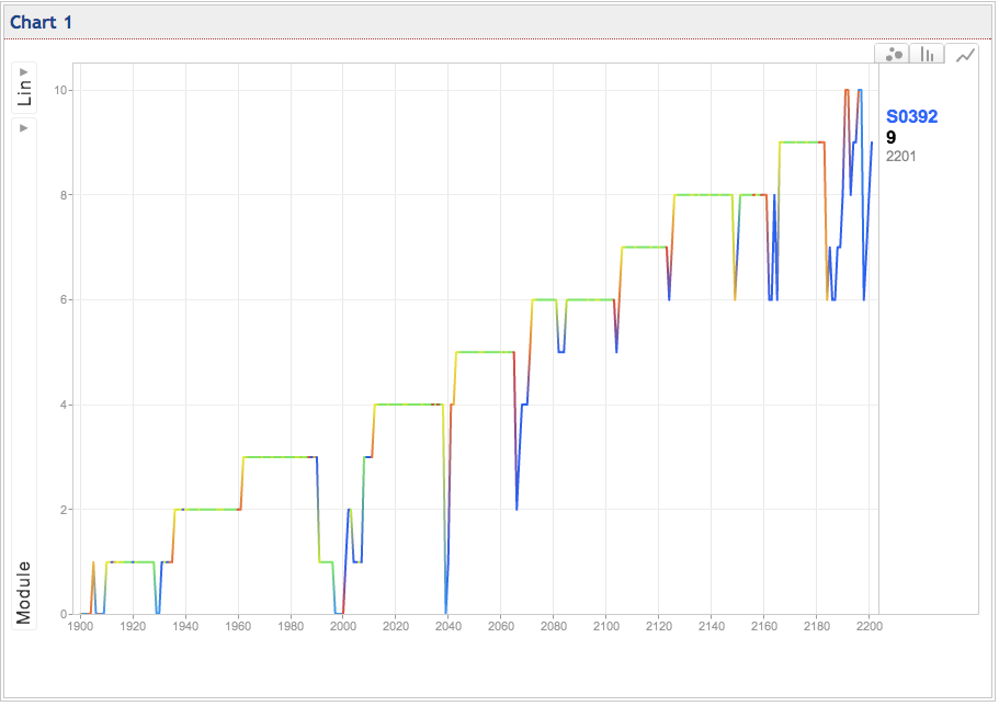
The motion map quickly illustrates that the student visited nearly every course element, and, after completing the first few modules, they did not need to return to the course information module. This indicates that the student quickly understood the design of the course. In addition, the video indicates that the student occasionally jumped back to earlier material in the course. Such movements may indicate that the learning materials in the location of the jump may need to be reviewed.
Now that we’re looking at student patterns over time, the analytics are much more meaningful from a learning perspective than they would be with just course completion rates or A/B testing results. Learning is a process that cannot be reduced down to independent events. With many online courses, students now can create their own learning pathways. In the example above, notice how the student frequently reviewed modules 0, 2 and 6. This information could be used to study how students learn and how to improve course designs. Research teams would do well to put more focus on learner patterns, and MOOC platforms would do well to make this research easier.
The UW La Crosse research team has not finished their analysis, but the early results show a much richer approach to analytics than focusing on single person-course measurements or aggregated analysis of a single event.