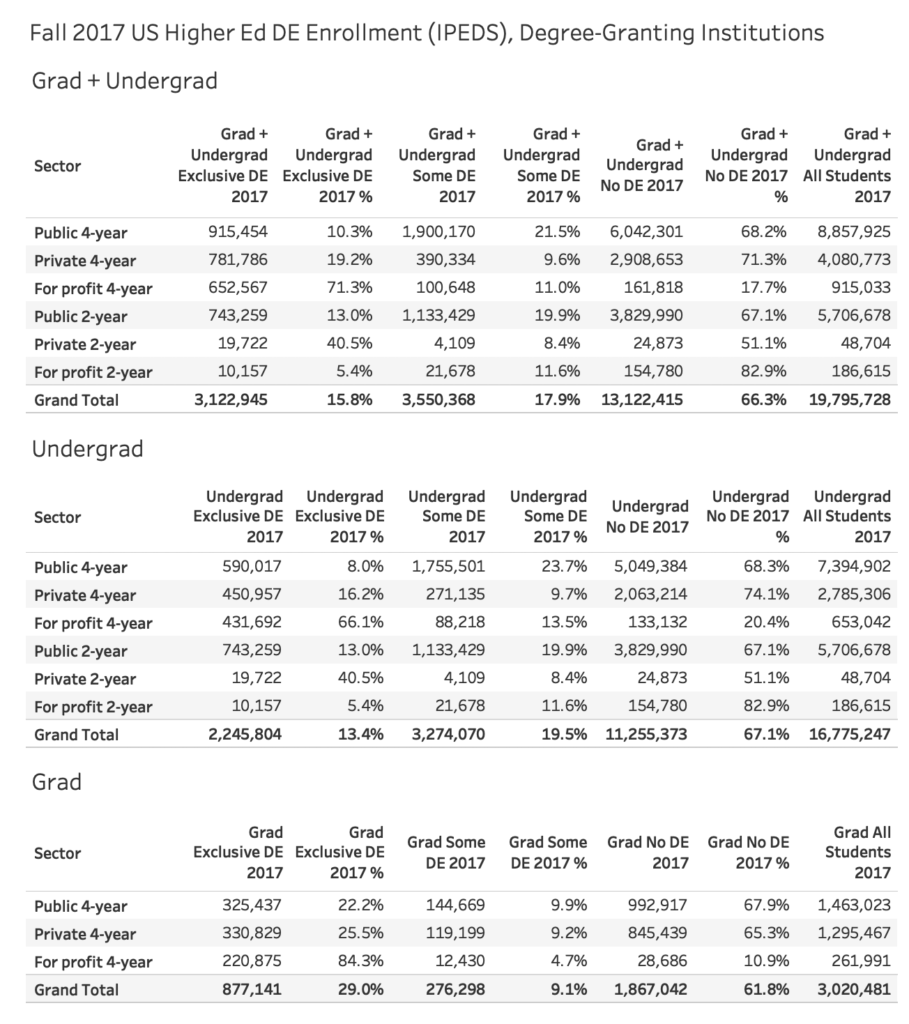
Update 19 Dec 2018: Images and interactive chart have been updated to fix mistake with sector of multiple institutions. Overall totals have not changed but allocations for each sector have. Thanks to reader Drew Bagley for discovering issue and even looking at data to point me in direction of fix. Post publish date has been updated accordingly.
The National Center for Educational Statistics (NCES) and its Integrated Postsecondary Education Data System (IPEDS) provide the most official data on colleges and universities in the United States. I have been analyzing and sharing the data since the inaugural Fall 2012 dataset.
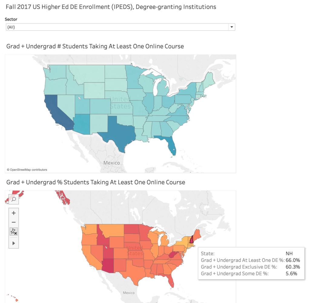
Below is a profile of online education in the US for degree-granting colleges and university, broken out by sector and for each state for the most recent, Fall 2017, data.
Please note the following:
- There are multiple ways to filter and select data. For this set, I have limited to U.S. degree-granting institutions in six sectors – public 4-year, private 4-year, for profit 4-year, public 2-year, private 2-year, and for profit 2-year. For undergraduate totals I have included degree-seeking and non-degree-seeking students (degree-granting institutions can offer non-degree programs). Note that this will give different totals than what was reported in the NCES First Look report.
- For the most part distance education and online education terms are interchangeable, but they are not equivalent as DE can include courses delivered by a medium other than the Internet (e.g. correspondence course).
- I have provided some flat images as well as an interactive graphic at the bottom of the post. The interactive graphic has much better image resolution than the flat images.
- There are two tabs below in the interactive graphic – the first shows totals for the US by sector and by level (grad, undergrad); the second shows a map view allowing filtering by sector.
Here is the map view of state data colored by number of, and percentage of, students taking at least one online class for each sector. If you hover over any state you can get the basic data. As an example, here is a view highlighting New Hampshire institutions.
Interactive Graphic
For those of you who have made it this far, below is the interactive graphic, which can also be found here. Enjoy the data.


Hi Phil, I could try to figure this out myself but I figured I’d ask you to do the research for me 😉 – does the IPEDS data give us an idea on the trend in total number of higher ed institutions and whether this is holding steady, declining, or growing? (cf. The Christensen Hypothesis)
My therapist warned me about answering questions set up this way . . . not sure who’s enabling whom.
The data is there, but the most recent analysis by NCES was through 2014-15 data:
https://nces.ed.gov/fastfacts/display.asp?id=84