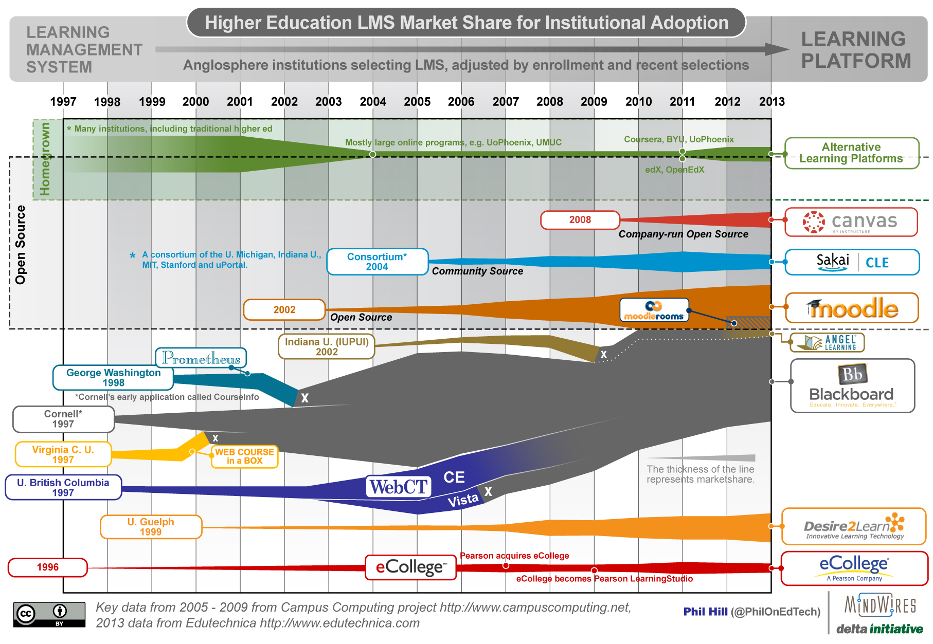
I shared the most recent graphic summarizing the LMS market in September 2012, and thanks to new data sources it’s time for an update. As with all previous versions, the 2005 – 2009 data points are based on the Campus Computing Project, and therefore is based on US adoption from non-profit institutions. This set of longitudinal data provides an anchor for the summary.
What I’ve been attempting to do lately is to expand the market definition beyond the US. Last year I used some heuristics:
The data has been adjusted to include international usage and online programs in order to capture the rise of online programs, including MOOCs, as a driving force in the future market. Keep in mind that there is no consistent data set to capture the entire market, so treat the graphic as telling a story of the market rather than being a chart of precise data. Sources for this summary include a combination of Campus Computing reports, ITC surveys, company press releases, and extrapolations from Blackboard’s and Pearson’s quarterly earnings. Caveat emptor. While the data captures a broader set of information than previous US-only data, it is primarily focused on north american institutions.
This year, thanks to George Kroner’s great work with Edutechnica, I can more confidently represent the model as covering more of the Anglosphere – the US, UK, Canada and Australia. This is done with a single data source for 2013 rather than interpretations among several sources.
Two items to note:
- Despite the addition of a new data source, the basic shape and story of the graphic have not changed. My confidence has gone up since last year, but the heuristics were not far off. Sakai is larger than shown last year.
- There are no dramatic changes to the market in general this year. The same players keep growing (primarily Canvas, followed by Moodle and Desire2Learn), and the same players keep shrinking (primarily Blackboard). The only new potential system of interest this year is OpenEdX.
- While the data is more solid for 2013, keep in mind that you should treat the graphic as telling a story of the market rather than being a chart of precise data.


You missed WebStudy which started before BlackBoard.